
A-Z of marketing: Logo design.
A logo is a tremendously important part of building a brand that your customers will instantly recognise. It is the first point of contact with the outside world and it’s the centrepiece of most branding schemes. So it’s vital to get it right.
Logos reflect values such as trust and loyalty and they have the power to evoke emotion, tantalise senses, and trigger memories. If you think of the ‘Coca-Cola’ logo, how do you feel? Can you almost taste the drink?
Your logo is your business’s personal profile; it’s a visual representation of everything your business, products, and services stand for. So when you’re considering a redesign or launching a new logo entirely, take some time to think about exactly what you want to portray.
Why your business needs a logo?
If you’ve been avoiding updating your small business brand with a new logo, maybe it’s time to stop procrastinating and remind yourself of the benefits of having an up-to-date logo. An effective logo will:
- Encourage faith in your products – You may have the best product the world has ever seen, but if it’s poorly packaged, without a logo or back up to show that it’s from a quality and trustworthy company, it will be harder to sell. How a product is packaged and branded is extremely important to today’s consumer.
- Make your company more recognisable – Many of your customers and potential customers will pay more attention to a visual advertisement than one full of text - a picture paints a thousand words as the saying goes. With our global attention span diminishing, it’s important to create a logo that is eye catching and memorable.
- Deliver a return on investment – The more people to see your logo, the easier it will become for them to associate it with your quality products, reliability and good customer service. This positive association builds up a sense of trust which, in turn, will mean that your audience will take more time to view anything with your logo on.
- Attract the right customers – A great designer will consider the colour, visual elements and typography of your logo. How your logo is designed will be specific to your industry and will be instrumental in attracting your target customers to your business.
Investing in a professionally designed logo and using it consistently to build a strong brand will encourage your customers to engage more readily and ultimately spend their money with you rather than your competitors.
Shapeshifting logos
A good logo these days isn’t just a static image, it can be much more than that. Today’s logo needs to be flexible with different configurations for specific purposes - eg digital formats such as social media, websites, blogs etc. Your logo also needs to work offline too - on printed literature, press ads, posters and so on.
Get to know your designer

So it’s a good idea to invest in a professional designer who understands the requirements of good logo design. If possible, choose a designer you strike a connection with - this personal touch will allow them to get to know a little bit about you and understand your business in more detail.
At Ketchup Marketing, our graphic designers like to ask questions such as: “Where do you see your business heading in five years’ time? How would you like your business to be described by others? What brands inspire you? What colours do you like and what do they mean to you? How do you like your tea/coffee?”
Ok, so they might be going off track a little with the last question, but they do like to tease out lots of information to work with in order to create a logo/brand design which radiates both the personality and aspirations of your business. Take a look at our case studies to find out more about Ketchup’s services here.
Steps to design a logo for a small business
So, in order to break down the approach to getting your new logo created, you need to consider the following seven points.
1: Identity and personality of your brand
Think about the identity and personality of your brand, ask yourself:
- What made us set up the business?
- What values and beliefs do we hold as a business?
- What makes us special and what do we do best?
- What words would we like our customers to use to describe our products/services.
2: Your industry and your competitors
Take a look at your industry and the marketplace and think about:
- How our business varies from those of our competitors?
- How can we differentiate our branding from our competitors?
- Are there any competitors brands we admire - and why?
3: Find inspiration
When you’re looking at your competitors, draw out elements you like and dislike from other logos - colours, fonts etc. It’s easy to pull together a mood board of images and this will help you choose the criteria for your final design.
4: Design style
Once you’ve done your research, it’s time to think about the style that will best suit your business. Is your company classic, vintage, modern, quirky or a little bit risqué? Of course, your style may overlap - for example you can be vintage and quirky or modern and risqué.
Always aim for easy recall. In today’s crowded market, most logos only get a quick glance, so you want to ensure that your logo design style is easy to take in and is memorable.
5. Logo types
There are seven types of logo design to choose from.
Monogram logos or lettermarks
Lettermark logos work really well if you have a long company name or one that is hard to remember. Many high profile companies choose to use their initials as their logo - think BMW, M&S, BBC…
Wordmarks
Wordmarks are one of the simplest ways of creating a logo and work well if your company has a name that looks good in typography. However, as with all design, the clever part is to take a business name and add a little design style to the typography so that it’s unique and reflects the company it’s portraying.
Pictorial marks
Pictorial logos are made up of an icon or graphic that is easily recognisable and represents your brand with an image. If you choose a pictorial mark as the basis for your logo, make sure it has a unique connection to your brand and that it is not too complex. Remember - it’s all about memorability!
Abstract logos
Abstract logos can work well as they are often striking and simple. Once you’ve associated your brand with an abstract icon, it can be outstandingly effective. Think Paypal and Spotify for starters...
Mascots
These are often used for businesses that want to be reflected in a light-hearted and fun context. Mascot logos are often illustrated cartoon characters that make you smile. Mascot logos can work very effectively, however, it is worth being clear about your motives for use; if you are choosing this style there can be negative associations such as unprofessional and lightweight.
The combination mark
This type of logo, as it suggests, combines a symbol and a word to represent your brand. Well known examples include Burger King, Starbucks Coffee, Doritos.
The emblem
Emblem logos combine a word and a pictorial element, similar to the combination mark. Often emblem logos will consist of a crest or a seal with integrated text. Think Warner Bros, Harvard University and even the Royal Family logo.
6: Colours
There’s so much to say about colour. Colours have different meanings and the psychology behind each is complex. Here’s a just a taster of the associations with the three primary colours.
Red: Powerful and attention grabbing. The colour red stimulates us and has both positive and negative associations including strength, courage, excitement, aggression, defiance and strain. Its effect can be physical; stimulating our pulse rate, giving the impression that time is passing faster.
Blue: A total opposite to red, blue has a calming effect on us - making us relax and slow down. This colour is often interpreted as soothing and serene and is associated with intelligence. However, it is also seen by some as cold, aloof and unfriendly.
Yellow: Is full of emotion. It’s seen as a positive, optimistic, friendly colour. However, negatively, it is associated with irrationality, fear, emotional fragility and depression.
Combining colours on the colour wheel
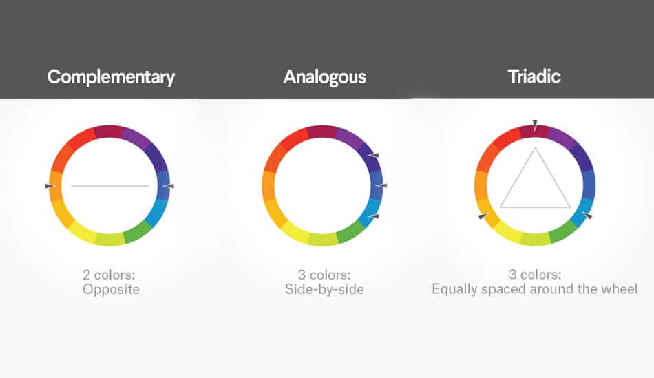
So you can see that each colour has its own range of emotions and meaning. Combining colours also stimulates a wide range of feelings and physiological effects too. For example, choosing colours that are similar to each other, as compared to opposites, could be interpreted as being harmonious or boring!
It is certainly worth looking at a colour wheel and the ways of combining colour. Whether you choose complementary, analogous (similar shades) or triadic (which sit in a triangle on the colour wheel) colours, you need to understand the subliminal messaging you might be making with your choices.
7: Fonts
Another vital component of any logo which contains text, is the choice of font and there are four basic types to choose from:
Serif - these fonts have a classic look as they have the little swirls at the end of the letters which make them look a little more old fashioned. These fonts can work really well with vintage and retro designs.
Sans serif - modern looking without swirls. Sans serif text looks sleek and simple and is great for use with contemporary brands.
Script - these fonts look essentially like handwriting. There are many to choose from, but one word of caution is to make sure that the script is legible as some of these fonts are so swirly it can be difficult to decipher the letters.
Display - highly stylised decorative fonts that are designed to be really eye catching.
And of course, you don’t have to just use one font! Combinations of types and sizes can look great too.
Consider the wider brand identity
If you’re finding all this information a little bamboozling and could do with some expert advice from one of our design experts, don’t hesitate to get in touch and discuss your branding requirements today.