
The messy middle of a brand refresh, and why it matters.
There’s a moment in every brand refresh where clarity disappears. Not completely, but enough to make you question what you thought you knew.
The direction felt obvious at the start, then new perspectives emerged, and brackets, strikethroughs, and highlights were an ongoing topic of conversation. New tensions surfaced, and new questions appeared. Suddenly, what seemed simple became nuanced.
And somewhere in the middle of the process, you realise: this is going to get messy. We’ll have to dig deep, remind ourselves who our brand is as a whole, and find the best way to represent it to the world.
Our new look, we decided, was going to be epic.
The part people don’t always see.
From the outside, brand refreshes can look quick, decisive, and clean. There’s a big ‘reveal moment’. But what isn’t visible is the thinking that happens beforehand – the discussions about what still feels true, the moments where something looks cool but doesn’t feel quite right. And the tension between wanting to evolve and wanting to stay recognisable.
How much did we want to hold onto, if anything?
There isn’t usually one big breakthrough. There are dozens of smaller ones, like a word that finally clicks, a layout that suddenly feels balanced, or a tone that feels more natural than forced. I.e., how the Ketchup Way became the guiding mindset to follow in our tone of voice.
Progress often looks like: trying something, adjusting it, killing it altogether – then bringing it back to life (the strikethrough, for example). Iteration isn’t inefficiency; it’s refinement.
Balancing heritage and progress.
One of the more complex parts of refreshing an established brand is knowing what to keep (we’re looking at you, brackets).
Because not everything needs to change. Some elements still carry meaning, while some have earned recognition. Some may even still feel aligned with who you are now.
The challenge is identifying the difference between valuable consistency and comfortable habit, and between recognisable identity and outdated expression.
We found ourselves asking: What is essential? What is flexible? What is ready to evolve?
Sometimes the answer was obvious, and sometimes it took longer. Often we had to properly articulate why something mattered.
And sometimes we had to let go of ideas we had grown attached to. That’s part of the process, too – no one said it’d all be pretty.
Spontaneous creativity.
Honesty breeds clarity.
A strong brand doesn’t happen through inspired ideas alone. It comes from honesty and structured curiosity – and it’s not always linear. Refreshing your own brand is also uncomfortable. You can’t hide behind client feedback.
You want to simplify without losing meaning, clarify without flattening personality, and strengthen without overcomplicating. It can be a push and pull kind of process.
But it all came so much easier once we’d nailed our brand values, a.k.a. our Ketchup satnav.
We started stripping things back and interrogating ourselves. What actually sounded like us? What had become habit? What were we saying because it was true… and what were we saying because every other marketing agency says it?
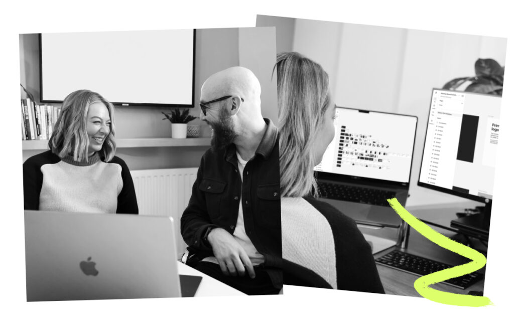
Some things survived the cut immediately. Straight-talking. Friendliness. Curiosity. Strategic thinking. Those still felt rooted in who we are and how we work.
Other things didn’t make it through creative surgery. The brackets were the obvious one, and so was the “sass” in our tone of voice. It had personality, sure, but it wasn’t doing anything meaningful.
Then there were the words we had to challenge harder. “Passionate” came up a lot. But what does that actually mean? Every agency claims to be passionate. It’s wallpaper language. The same happened with words like “saucy”. Fun? Maybe. But also a little twee and not substantial enough to build a brand around.
What we realised was this: some of the things that mattered most about Ketchup weren’t being said at all. Hard graft. Care. Energy. Showing up properly for clients. Those were the traits people experienced when they worked with us, but they weren’t consistently reflected in how we presented ourselves.
We also discovered something slightly uncomfortable: if everyone in the business explained Ketchup differently, then we didn’t yet have enough clarity. The lack of a consistent elevator pitch told us we still had work to do.
The moral of the story? The sooner you can be brutally honest about who you are as a brand, the easier the right ideas start to flow.
Why the messy middle is valuable.
But this is often where the strongest thinking happens, because this is where assumptions are tested. It’s where surface-level decisions give way to more intentional ones – and where instinct becomes strategy.
We learned that clarity comes through conversations, disagreement, experimentation, and occasionally scrapping ideas you were convinced would work.
But when it finally clicks, you feel it. And we finally do.
“I'm excited about the new brand and how it has brought the team together.”
–Michelle Jones, Managing Director
Bringing ourselves behind the curtain.
We applied the same process to ourselves as we would our clients:
- We did workshops we call Creative Surgery sessions.
- We had disagreements, which narrowed down our path in a helpful way.
- Our designers did lots of moodboards.
- The creative teams had plenty of difficult conversations, both amongst ourselves, and with leadership.
- There was inevitable creative tension.
- And there was plenty of iteration throughout the process.
Now, back to that drumroll moment…
Let’s go back to that room on Ketchup Day, where the creative teams were up front presenting. Cue the musical build-up, and just like that, we were guiding everyone through the rebrand. Let’s get into the details this time.
We revisited our new brand manifesto, which everyone had been updated on a couple months prior. We reiterated the reworked brand values. Then, we gave them some behind-the-scenes bits: early sketches, things we knew weren’t working, and the messy process of finding our new ikon.
“It’s time… for change,” our slides provoked.
Finally, we dove in. Kitty, one of our Graphic Designers, began explaining our new colours and the psychology behind them, and the typography next. Our Creative Copy Manager, Graeme, introduced the new tone of voice pillars, and Kim, one of our Copywriters, brought attention to why each one mattered in its own way. Kitty then jumped back in to explain the new photography style we would be using, and then proudly introduced the newest iteration of the Ikon, explaining how it could also be used as our unique mark on case studies.
“Working out how your brand sounds is as important as how it looks. We wanted a style that felt unique to Ketchup, and captured our confidence, our expertise, and our 'take no sh*t' attitude.”
“One thing was non-negotiable: our written comms couldn't sound like they'd come from any other agency. The result is a tone of voice that's loud, proud, and totally unafraid to explain things exactly as they are. Just like us, really.”
–Graeme Bains-Hall, Creative Copy Manager
Introducing, the Ikon.
Part of our presentation was the new Ketchup logo, the Ikon. This symbol was the subject of many, many iterations. It was sketched, pitched, crumpled up and thrown out, and pitched again.
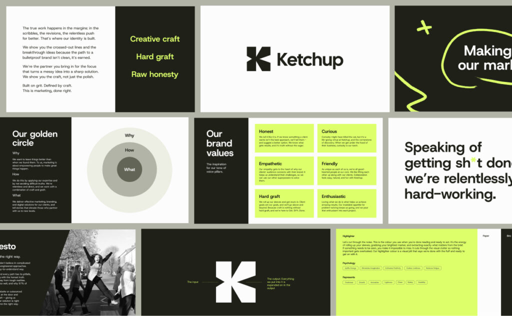
In the end, we love what we landed on. It’s an abstract ‘K’, but it stands on its own as an entity of Ketchup, working as both a spotlight on case studies and in social posts, and also serving as a brutalist-styled symbol.
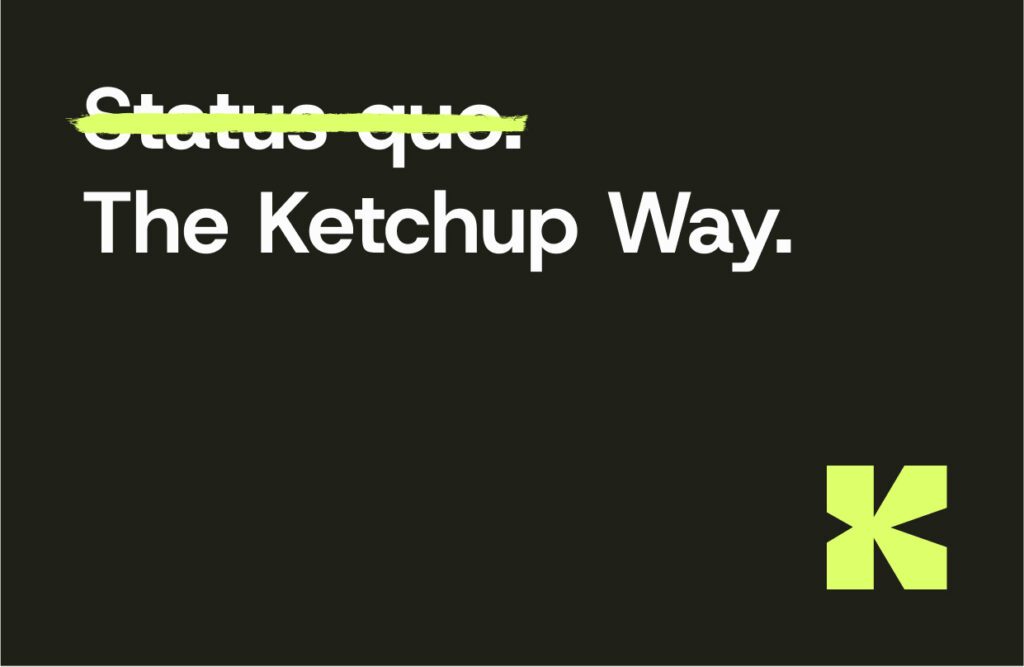
Status quo.
The Ketchup Way.
Next, it was time to unveil the strikethrough and highlighting devices. The Copy Team explained how they would work as tools to put our new brand values into action, each serving their own purpose. The strikethrough was there to create contrast between everyone else and the Ketchup Way. The highlight was meant to emphasise words that suit our tone well, and to add eye movement.

Kitty then covered examples of all the places the new visual style could be applied – from social graphics to merch and beyond. It’s safe to say people were excited, and not just about the merch.
A big sigh of relief… it was out, and everyone finally knew.
What this means for you.
The refresh doesn’t change what we do – it clarifies how we do it. The goal was never to appear different, but to feel aligned.
It reflects the level of strategic thinking we bring to our partnerships. The care we apply to craft. And the hard graft that you can expect from a partner that fights your corner.
For our clients, that means the things that matter most only get stronger:
- clearer conversations
- smoother onboarding
- sharper reporting
- better alignment across our teams
And when a brand knows exactly who it is, decisions happen faster, ideas land harder, and the work becomes stronger as a result.
It also gives a name to the mentality that’s always driven us: the Ketchup Way. A mindset built on honesty, curiosity, collaboration, and graft. For our clients, that means a partner that will keep questioning, improving, and pushing for better results alongside you.
“Over the years, the team and the culture at Ketchup has changed - this new branding feels more authentically ‘Ketchup’ in 2026.”
–Benjamin Marshall, Client Director
Considering a refresh?
A brand refresh doesn’t always require radical change. Sometimes it simply requires the confidence to express what is already true. The strongest refreshes don’t abandon identity. They refine it.
They remove what no longer supports the direction of travel, and they strengthen what does. They create space for the business to keep growing, while acknowledging that clarity is rarely instant.
It’s built thoughtfully, collaboratively, and iteratively, and often through the messy middle.
Advice from one of our Graphic Designers.
Kitty is one of the biggest moving forces behind branding, both for Ketchup and our clients. She’s been kind enough to lend a few pointers for this piece.
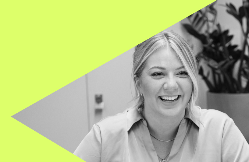
“Don’t start with the logo. Start with the reason the rebrand is needed in the first place. The strongest outcomes come from understanding what’s changed, whether that’s the audience, the ambition, the positioning, or simply how the business wants to be perceived moving forward."
A few things I always recommend:
- Focus on clarity before creativity; if people don’t understand the brand, the visuals won’t fix it.
- Think beyond the identity itself and consider how the brand needs to work across websites, social content, print, presentations, and real customer journeys.
- Don’t design for trends or for internal opinions alone. Design for longevity and for the people actually interacting with the brand every day.
- And finally, give the process space. The best rebrands are rarely instant lightbulb moments. They’re shaped through testing, refining, and asking the right questions along the way.
— Kitty Smith, Graphic Designer